Warhammer’s Latest 30k Armor Is Not Up To Par
My favorite armor has always been Mark 3. The large, overlapping rivet-studded panels add a lot of grimdarkness to Warhammer 40,000, but I find normal Space Marines wearing Mark 8 or 9 to be just too tidy. It has a knightly feel about it, as if these Marines are still galloping over planets ten thousand years after they pieced together their own plate armour in the thirty-first millenium.
The fact that I adore Iron Hands so much also definitely helps. Since the Mechanicum didn’t even have a Codex at this point, therefore I ran them as Guard, the tenth legion has always been the ideal complement to my Mechanicus forces. They also look gorgeous in that heavy, vintage armor. Iron Hands are a natural fit with Iron Armour.
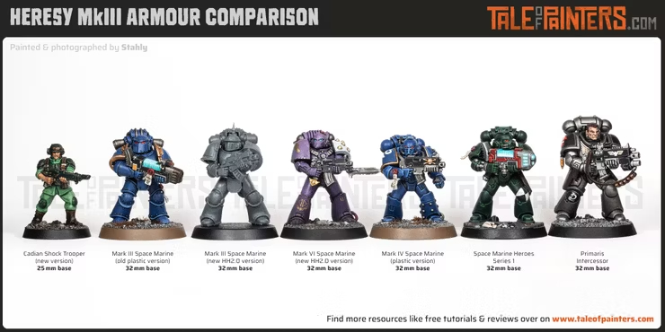
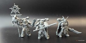
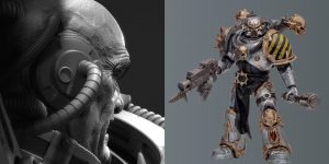
But there’s just no magic in the new plastic Mark 3 Space Marines kit. As part of the new MKIII Tactical Squad, the gear is available for pre-order, but there’s just something off about it.
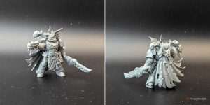
To begin with, there are issues with the armour plates. Smoother and sleeker than bulky and overdone. The plates are less piecemeal and the rivets are less noticeable. They may have lost a lot of their individuality, but they still don’t look like the formidable combatants the Angels of Death ought to be.
The farther up the body you go, the more prominent this becomes. The bodies are at least upgraded to better match with the Primaris forces that Games Workshop is encouraging us to play with, but the new Mark 3 shoulder pads are even more hideous. The rims are thinner and more like the armor of the Mark 7 rather than the traditional Mark 3.
These thirty thousand warriors resemble Diet Marines due to the thicker, additional pauldron plates that are also skinnier. I’ll be getting some vintage shoulder pads to outfit my Iron Hands if I decide to get any of the new plastics. But the shoulders are more attractive than the heads.
With the new helmets, I don’t even know where to start. They are compressed and flat, and they seem to fall between Marks 1 and 2 in terms of design. There aren’t many similarities to the previous Mark 3, which played a significant role in creating the recognizable appearance of the armor. The sturdy grill, which appeared capable of opening to show the mouths of your Space Marines, suddenly lacks all personality. It resembles the armor of a Bretonnian or knight of the round table.
Since the new heads appear to be right out of the Chaos range, I have a feeling that Death Guard players will be pleased with these. Although it won’t make much of a difference in the big picture, Nurgle enthusiasts might be interested in trading components with those of us painting other legions.
Mark 3 armor has an air of individuality. Unfortunately, instead of bringing the range into compliance with contemporary design rules, the revised plastics have eliminated all of that. The Mark 3 is designed to withstand suicidal boarding maneuvers and emerge undamaged, hence it’s intended to be big and unmanageable. By putting all of the fun into the helmet, Games Workshop has essentially stripped down the armour to something significantly more generic. A helmet that is far from the bulky visor of the past and has a style that is almost comical. While this is a kit that can be salvaged with little effort, I won’t jump to the conclusion that Games Workshop has ruined Mark 3 armor or anything, it’s reasonable to say that it fell short. Do you understand?




Post Comment